How Stain Colors Influence Buying Decisions and Elevate Design

Why Security Is Accelerating the Conversation
Few issues have influenced opening design more significantly in recent years than school security.
As incidents involving violence in educational facilities have increased, schools, architects, and security professionals have reevaluated long-standing assumptions about how buildings protect occupants during emergencies.
Historically, security strategies focused heavily on perimeter protection. The goal was preventing unauthorized individuals from entering the building.
Today's threat landscape is different.
Many incidents involve individuals who already have legitimate access to the facility. In these situations, the focus shifts from perimeter control to interior survivability. The classroom door becomes more than a building component—it becomes a critical protective barrier.
This change has fundamentally altered how the industry evaluates opening performance.
Questions are no longer limited to whether a piece of glazing can resist impact or whether a lock meets a particular standard. Stakeholders increasingly want to know how the entire opening assembly performs when subjected to realistic attack conditions.
The answer cannot be determined by evaluating individual components alone.
Not All Openings Perform the Same
Two classroom doors may appear virtually identical to an observer.
Both may use similar materials. Both may satisfy applicable building codes. Both may contain comparable glazing and hardware.
Yet under forced-entry conditions, those openings may perform very differently.
Performance is influenced by numerous factors, including:
Door construction and core design
Frame design and anchorage
Hardware reinforcement
Glazing systems
Fasteners and attachment methods
Installation quality
Interactions between components
In many cases, vulnerabilities emerge not from the primary component being evaluated, but from adjacent elements within the assembly.
A highly resistant glazing system may not compensate for inadequate frame reinforcement. Likewise, a reinforced door may not achieve intended performance if hardware attachment points become the failure mechanism.
These realities have led many industry professionals to conclude that opening performance can only be fully understood by evaluating the complete system.
The Evolution of Active Shooter Testing
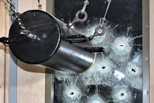
As concerns surrounding school security intensified, the industry began developing more realistic methods for evaluating opening performance.
Earlier testing approaches often examined ballistic resistance, burglary resistance, or manual attack independently. While valuable, these methods did not fully represent the sequence of events associated with many active shooter scenarios.
The development of FTD-SA marked an important advancement by combining ballistic attack with subsequent forced-entry testing. Rather than focusing solely on whether glazing could stop a projectile, the methodology evaluated how the opening performed after sustaining damage.
This represented a significant shift toward systems-based evaluation.
For the first time, testing focused not only on individual components but also on the opening's ability to maintain integrity under a realistic sequence of attacks.
The industry's continued pursuit of consistency and broader adoption eventually led to ASTM F3561, which formalized many of these concepts through a consensus-based standard.
Need help selecting the right product?
MoreBlogs